How to Find Your Best-Performing Content
Ranking posts is the easy part. This is about finding the pattern behind the winners, and knowing when you've got enough posts to trust it.

Quick guide
Rank against your own median rather than an industry benchmark, then look for what the top posts share (format, opening, timing) and check the sample size before you change anything.
- Open Analytics → Top Performing Posts for the ranked list.
- Use Content → What Works Here to see which formats, topics and lengths beat your median.
- Read the confidence line. A pattern from 24 posts is a direction to test, not a rule.
- Check Best Time to Post for timing drawn from your own history.
- Or just ask Hyvo AI to find your best posts. You get the ranking and the shared pattern in one answer.
The full walkthrough is below.
Every analytics screen can tell you which post got the most impressions. That's rarely the useful question. The useful question is what the good posts have in common, because that's the only part you can do again on purpose.
So here's how to get from a ranked list to an actual pattern, how Hyvo separates a finding from a coincidence, and what to do with the answer.
Compare against yourself, not an industry average
Published benchmarks like "the average engagement rate on LinkedIn is 2%" are close to useless for one specific account. They average across company sizes, audiences and posting rates that have nothing to do with yours.
The comparison that means something is your own median. A post that did 1.6× your median did well *for you*, and that's the only version of the claim you can act on.
Hyvo does it that way throughout. Rankings, patterns and the assistant's answers are all stated against your own baseline instead of somebody else's.
It's also why we put the sample size on the card instead of tucking it into a tooltip. A pattern from eight posts and a pattern from a hundred look identical on a bar chart, and only one of them is worth changing your week over.
Step 1: The ranked list
Analytics → Top Performing Posts is where to start.
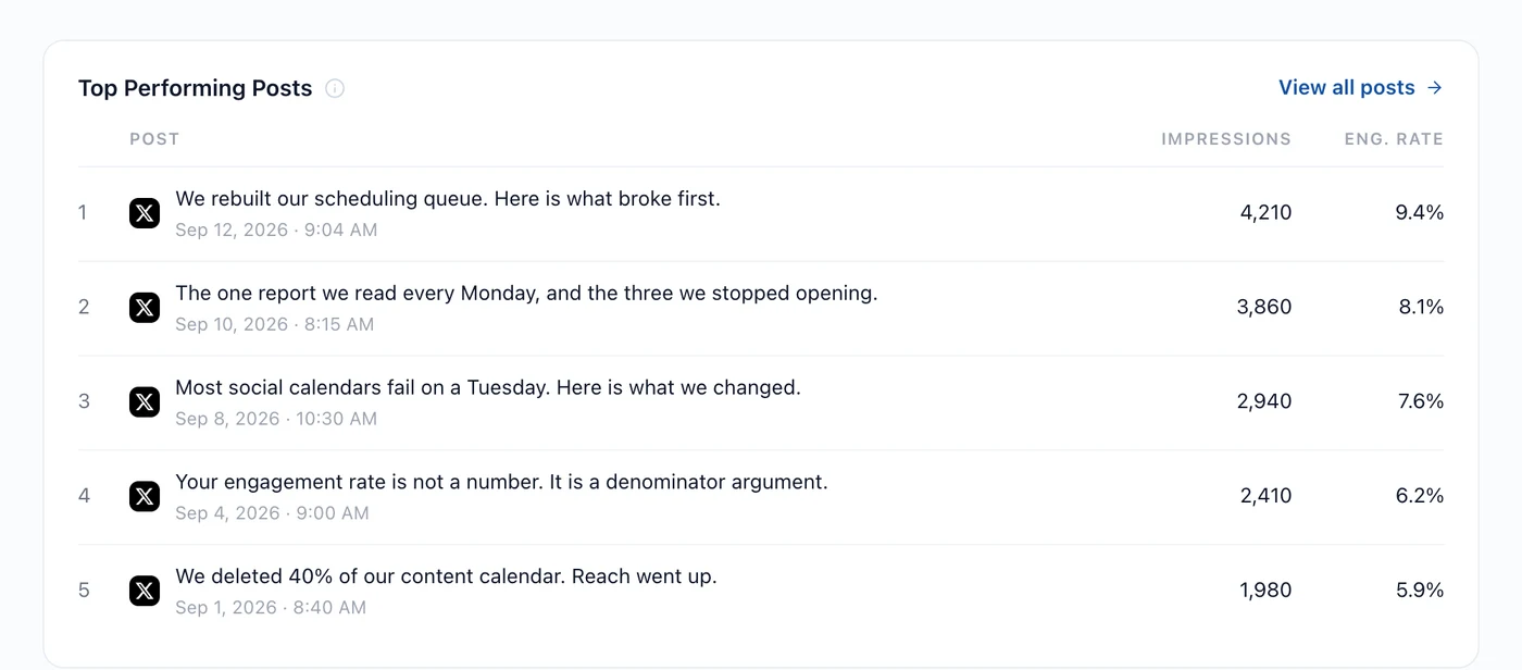
Read it for the obvious stuff first. Is there a format that keeps showing up? A topic? A time of day? You can often see the pattern here before any analysis names it for you.
Two things to watch. Older posts have had longer to collect numbers, so a two-month-old post at the top might just have had more time. And impressions reward reach while engagement rate rewards resonance. A post ten thousand people saw and nobody responded to isn't a success worth repeating.
Step 2: The pattern behind them
The ranking tells you which posts. What Works Here, in the Content section, tells you what they've got in common.
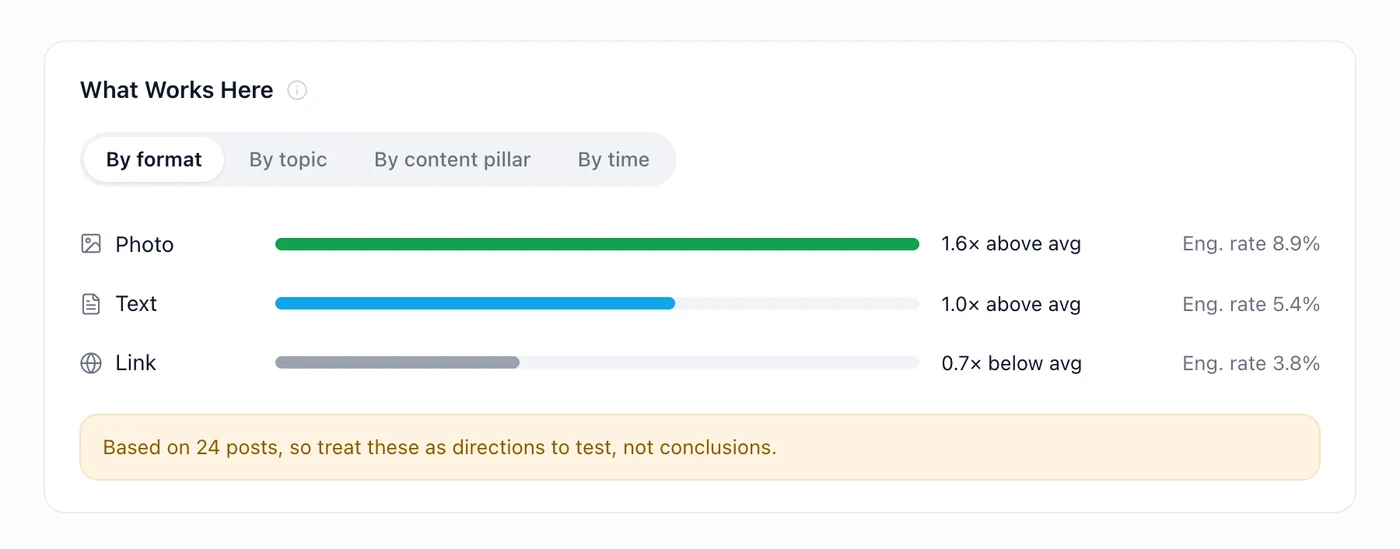
The four groupings answer four different questions:
- By format: do photos, text posts or links do better for you?
- By topic: which subjects your audience actually responds to.
- By content pillar: whether your recurring buckets are pulling their weight.
- By time: whether when you post is doing anything at all.
Step 3: Read the confidence line
This is the bit most analytics tools leave out, and it's the bit that decides whether you should act.
Look under that card: *Based on 24 posts, so treat these as directions to test, not conclusions.* Twenty-four posts split across three formats is eight per group. One unusually good photo post drags the whole photo average up with it.
A rough guide to how much weight to put on a finding:
| Posts behind the group | What it means |
|---|---|
| Under 10 | Noise. Interesting, not actionable. |
| 10–30 | A direction worth testing on purpose. |
| 30–100 | A pattern you can plan around. |
| Over 100 | A property of your account. |
At 10–30, the move isn't to change everything. It's to run the test: post more of the thing for a fortnight and see whether the gap holds up.
Step 4: Timing
Best Time to Post is the same idea applied to hours and weekdays.
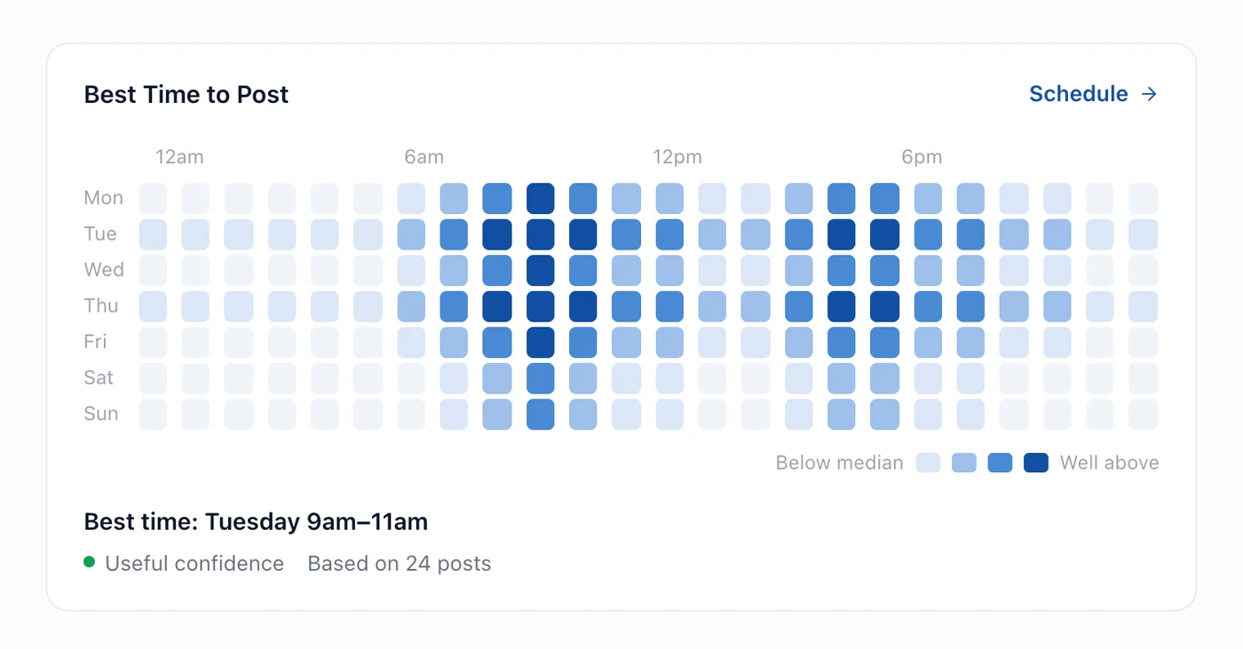
Same caution applies, only harder. A week has 168 hours, so 24 posts spread across them is thin. Treat the strongest block as a hypothesis and post into it deliberately for a few weeks.
Step 5: Or just ask
Everything above is one question to Hyvo AI, which reads the same data and adds the interpretation.
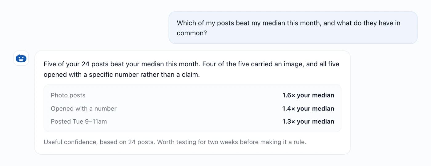
Worth asking: *Find my strongest posts and tell me what they have in common.* Or *What kinds of post outperform my median, and how confident is that?* On Premium, Agent's Audit my content goes through your recent output end to end and comes back with the three changes worth making.
What to do with the answer
- Pick one change. Not five. One is testable; five is a new strategy with no way of knowing which bit worked.
- Run it for a fortnight. Long enough for a handful of posts at your rhythm.
- Compare against the same window before it. Analytics has a comparison control for exactly this.
- Then decide. Keep it, drop it, or try a variation.
Findings feed straight back into content, too. A format that reliably beats your median is a candidate for repurposing your best ideas and an obvious bucket in the calendar you are filling.
What free and Premium see
Free reads its own numbers: headline totals over 7 or 30 days, and the platform split behind them. That answers "how am I doing".
Premium adds the interpretation (What Works Here, Best Time to Post, audience analysis, period-over-period comparison) and history going back a year.
Where this goes wrong
- Acting on a sample of eight. The confidence line is there for a reason.
- Optimising for impressions. Reach without response is a distribution result, not a content result.
- Comparing across networks. LinkedIn and X count different things. understanding engagement explains why those numbers aren't comparable.
- Changing everything at once. Then nothing's attributable and you're back to guessing.
FAQs
How many posts do I need before analytics says anything useful?
Around thirty is where patterns start being worth testing. Under ten, treat it all as noise.
Why isn't my best post the one I expected?
Usually because it was specific where the others were general. Read the top five for what they share rather than judging them one at a time.
Can I compare this month against last month?
Yes, with the comparison control: previous period, or the same period last year. Comparison comes with Premium.
Why do some posts show no impressions?
Because the network doesn't publish that number. We leave it blank rather than showing a zero that looks like a measurement.
Does the ranking include posts I published outside Hyvo?
Yes. Connected accounts bring their history across, so the ranking covers everything you've put out.
About the author

Founder, Hyvo
Subarna Basnet is the founder of Hyvo, an AI-powered platform helping businesses create, manage, and automate social media marketing. He writes about AI, social media automation, content creation, and marketing technology.